
Since the dawn of the digital age, emails have been the go-to RSVP for connecting with the crowd—whether that's your squad or a swarm of eager customers. And let's be real, the competition for the coolest email on the block gets fiercer every year.
But let's talk turkey—whipping up that perfect email can be like chasing the last slice of pizza at a party. Even the most seasoned pros in the email game sometimes hit the wall, trying to craft that chart-topping hit that makes both hearts and metrics sing. So if you're staring at a blank template wondering where the party went, you're in good company. Let’s shake things up, shall we?
Table Of Contents
Why Does Email Design Even Matter?
Think of email design as your front-line soldier in the battle for attention. It's not just about looking good; it's about clarity, usability, and making sure your message punches through the noise.
A well-crafted design guides the reader's eyes like a seasoned tour guide, showing off your content's best bits so they actually get seen. It's the difference between a reader pausing to say, 'Hey, tell me more,' and 'just another email'.
And let's not forget, good design doesn't just signal quality; it shouts credibility. So yeah, when it comes to email marketing, great design isn't just the cherry on top—it's the whole sundae.
What Are The Types of Email Design?
Each email design type has its own mood, audience, and purpose. For example, when you're sharing an important update from your team, a plain text email gives it that personal, 'just between us' feel. But let's say you're launching a flashy new product line—this is where rich HTML email comes in, turning your announcement into a visual feast that's hard to ignore.
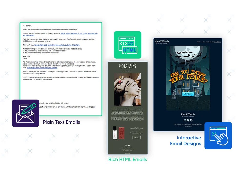
1. Plain Text Emails
No frills, no fuss, just straight-up text.
But don't let their simplicity fool you. They're the go-to for personal, no-nonsense communication that cuts through the digital glitter. Plain text emails focus on the message, not the medium, making them a favorite for straightforward, sincere communication.
2. Rich HTML Emails
Here's where the color palette explodes. Rich HTML emails are full of color, images, and fancy fonts. They're designed to catch eyes and hold attention. Perfect for newsletters, promotions, and any message that screams, 'Look at me!' They're like a party invitation, dressed to impress.
3. Interactive Email Designs
The latest trendsetters in town.
They're not just to be seen; they're to be experienced. Think clickable buttons, embedded videos, and elements that move or change based on user interaction. They're all about engagement, turning a passive reader into an active participant. It's like turning your email into a mini-website, offering a whole new level of interaction.
What Are The key Elements of Email Design?
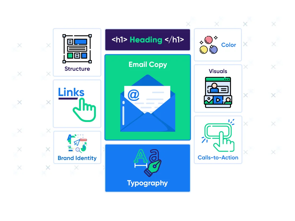
1. Email Copy
The meat of your email copy is the written content that communicates your message.
Best Practices
Keep it concise and on point.
Use a conversational tone for readability.
Highlight key points or offers early.
Personalize where possible for engagement.
Ensure clarity and purpose in every line.
2. Heading
This is the attention-grabber, the first line of text that sets the stage for your email.
Best Practices
Make it catchy yet relevant.
Keep it short and sweet.
Align with the email’s overall tone and topic.
Use action words or questions to spark curiosity.
Test different headings for effectiveness.
3. Structure
Structure refers to the layout and organization of elements in your email.
Best Practices
Use a clean, easy-to-follow layout.
Place important information above the fold.
Use bullet points or short paragraphs for readability.
Balance text with visuals.
Ensure a mobile-friendly design.
4. Links
Links are clickable elements that direct the reader to additional content or actions.
Best Practices
Make sure links are clearly identifiable.
Use descriptive anchor text for context.
Limit the number of links to avoid overwhelm.
Check that all links are working correctly.
Track link clicks for insights.
5. Calls-to-Action (CTAs)
CTAs are instructions to the reader, encouraging them to take a specific action.
Best Practices
Use action-oriented language.
Keep CTAs clear and concise.
Place CTAs prominently.
Limit to one or two per email for focus.
Test different CTA designs and placements.
6. Visuals
Visuals include images, videos, or graphics that complement your email content.
Best Practices
Use high-quality and relevant visuals.
Ensure visuals align with your brand.
Optimize for fast loading.
Use alt text for accessibility.
Balance visuals with text.
7. Color
Color involves the palette used in your email, impacting its look and feel.
Best Practices
Choose colors that reflect your brand.
Use contrasting colors for readability.
Limit the palette to a few complementary colors.
Use color to highlight key areas.
Ensure good color contrast for accessibility.
8. Typography
Typography is the art of arranging types to make the copy legible and visually appealing.
Best Practices
Use clear, easy-to-read fonts.
Maintain consistent font styles.
Use font sizes that enhance readability.
Limit font variety.
Ensure good text hierarchy and spacing.
9. Brand Identity
This is the overall expression of your brand in your email, including logo, color scheme, and tone.
Best Practices
Ensure consistent brand representation.
Include your logo and brand colors.
Align the email’s tone with your brand voice.
Be consistent across all marketing channels.
Use brand elements to build trust and recognition.
Extending your visual identity beyond email is key to maintaining a cohesive brand presence. Exploring a digital business card design idea that complements your email aesthetic helps reinforce consistency across every customer touchpoint.
Some Inspiration To Make Your Emails Beautiful
1. Duolingo’s Engagement Email
Engaging Theme and Storytelling
The email uses a playful narrative of the app's mascot going through different emotions, providing a story that readers can follow, increasing engagement and memorability.
It cleverly integrates the mascot's reactions with common feelings associated with New Year's resolutions, making the content relatable and entertaining.
Creative Use of Visuals
The visuals are vibrant, fun, and aligned with the brand's image, ensuring instant recognition.
The illustrations are not just decorative; they enhance the storytelling by showing the mascot in various states, which adds to the emotional appeal of the email.
Clever Integration of Calls-to-Action (CTAs)
CTAs are seamlessly woven into the storyline, making the act of starting a lesson part of the narrative, which can be more compelling than a standalone button.
The button design is consistent and prominent, making it clear what action the reader should take next.
2. Spotify’s Promotional Email
Personalization and Relevance
The headline "Playlists for you" immediately personalizes the experience, suggesting curation and care in the selection of content.
It taps into the idea of personalization, which is a powerful tool in marketing, making each recipient feel like the message was crafted just for them.
Visual Engagement
Each playlist is represented with a unique and visually engaging image that not only reflects the theme of the playlist but also appeals to the emotions—encouraging clicks.
The use of visually distinct and thematic imagery for each playlist segment helps to break up the content, making it easily digestible and interesting to scroll through.
Brand Consistency
The email maintains Spotify's brand consistency with its color scheme, typography, and overall aesthetic, reinforcing brand recognition.
The clean, modern look of the email aligns with Spotify’s brand identity as a leading music streaming service, which is familiar and appealing to its users.
3. Heyday’s Promotional Email
Targeted Content
It speaks directly to the reader's potential situation (" Sick Day" Skincare Routine), making the content feel personalized and timely.
The email provides actionable steps that address a specific need, creating a sense of empathy and understanding from the brand.
Cohesive Layout and Flow
The layout is streamlined and easy to navigate, with a clear progression from one step to the next, guiding the reader through the recommended routine.
Each product is accompanied by a CTA, making it effortless for customers to make a purchase without overwhelming them with options.
4. Tempo’s Offer Email
Clear Value Proposition
The offer is boldly stated at the top, creating a sense of urgency and emphasizing the value the customer will get by acting now.
The messaging is clear and direct, with a strong headline that connects emotionally by focusing on the concept of transformation within a year.
Testimonial for Social Proof
Including a customer testimonial adds credibility and relatability, which can significantly influence purchasing decisions.
The use of a real member's quote reinforces the community aspect of the brand and addresses potential customer concerns regarding gym culture.
Personalization Through Technology
Showcasing the AI-powered training and personalized workout plans demonstrates the brand's innovative approach, appealing to tech-savvy consumers.
It highlights unique selling points that set the brand apart from traditional gyms, emphasizing personalization and technology.
Let’s Get Started
Email design is the spotlight that can make your message the star of the show. It's not just about colors and fonts; it's about crafting a visual handshake that says, 'Hey, let's talk.' Because when your email pops in a crowded inbox, you don't just get opened; you start conversations.
Not sure where to start your email design? Think of SendX as that friend who always knows just what to wear, no matter the occasion. With a closet full of professional and aesthetic templates, SendX helps dress your emails for success, ensuring they never go unnoticed. There's a 14-day trial with your name on it, completely on the house. Try it out and let's make everyone send an event to remember.