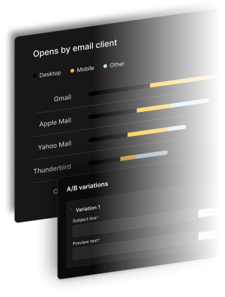


Opens by email client
Desktop
Mobile
Other
Gmail35%
Apple Mail25%
Yahoo Mail18%
Thunderbird12%
A/B variations
Variation 1
Subject line*
Preview text*
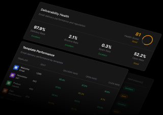
Email that reach inboxes
Our industry-leading deliverability ensures your messages don't end up in spam folders.
Sender reputation monitoring
We constantly monitor your sender reputation to ensure maximum deliverability.
Deliverability analytics
Get detailed reports on delivery rates, bounces, and spam complaints.
Automatic IP warming
Our system gradually builds your sending reputation for optimal inbox placement.