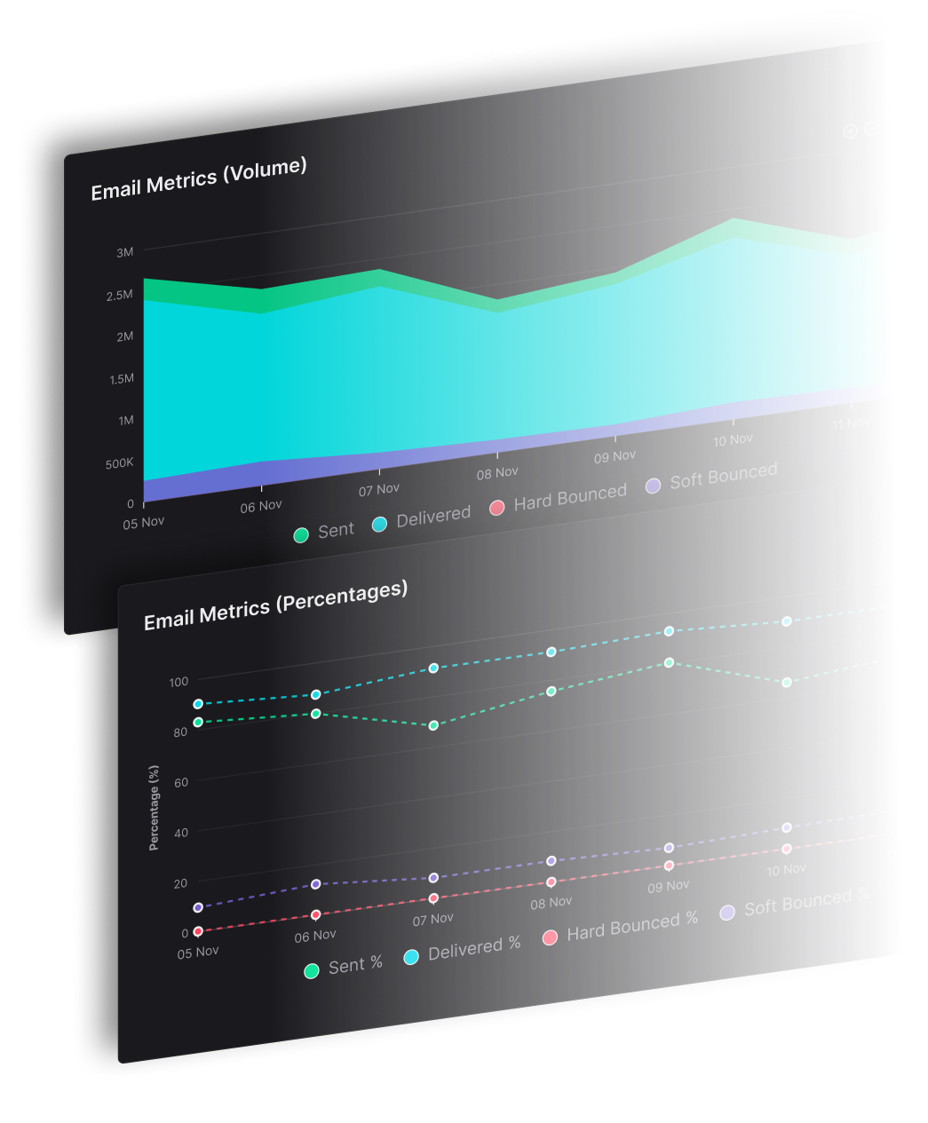
Most tools report on the campaign and stop there. SendX reports on campaigns, contacts, lists, tags, forms, workflows and drips separately — so when a number moves you can tell which part of your sending moved it.
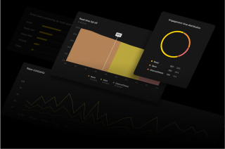
Campaign stats answer "how did that email do". The other five answer "and why" — which list, which form, which workflow step, which contacts.
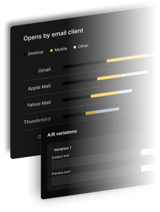
Open and click rates come as both unique and total, so a single reader refreshing five times does not read as five people. Bounces split into hard and soft, because a dead address and a full mailbox need different responses. Device, email client and geography are broken out on every campaign, and all of it is Core — none of it sits behind a higher plan.
A drop in opens is rarely about the email. It is a list that has gone stale, a form pulling in the wrong signups, or a workflow step nobody reaches. SendX reports on each of those on its own — contact growth and engagement scores, per-list and per-tag engagement, per-form conversion rate, per-workflow and per-step performance, and per-step drip trends.
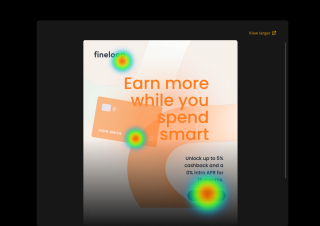
Click heatmaps show which links in the email actually got the clicks, so you can tell a strong CTA from one that only looks strong. Two add-ons go further where it matters — bot detection strips automated opens out of your rates, and read depth splits each open into whether it was genuinely read, skimmed, or glanced at.
The dashboard tells you something changed. These three steps are how you find out what.
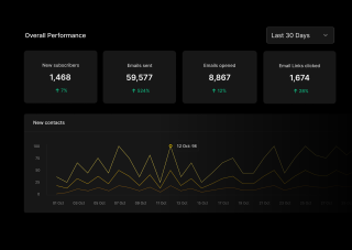
The dashboard opens on your last campaign summary and your totals sent, opened and clicked, each against the previous period. That period-over-period figure is the part worth reading first — a 30% open rate means little on its own and a lot next to last month's 38%.
Inside a campaign, the engagement timeseries shows when opens actually happened rather than just how many. Device, email client and geographic breakdowns sit alongside it, which is usually where a sudden drop explains itself — one mailbox provider behaving differently from the rest, or a template that broke on mobile.
If the campaign looks normal, the cause is usually before it. Contact analytics show whether your active share is shrinking. Per-list and per-tag engagement show whether one source is dragging the average down. Form analytics show whether a signup form started converting differently. Workflow and drip reporting show which step people stop at.
The dashboard opens on your last campaign summary and your totals sent, opened and clicked, each against the previous period. That period-over-period figure is the part worth reading first — a 30% open rate means little on its own and a lot next to last month's 38%.
Inside a campaign, the engagement timeseries shows when opens actually happened rather than just how many. Device, email client and geographic breakdowns sit alongside it, which is usually where a sudden drop explains itself — one mailbox provider behaving differently from the rest, or a template that broke on mobile.
If the campaign looks normal, the cause is usually before it. Contact analytics show whether your active share is shrinking. Per-list and per-tag engagement show whether one source is dragging the average down. Form analytics show whether a signup form started converting differently. Workflow and drip reporting show which step people stop at.
Everything you need to know about SendX and our services. Last updated June 2026.
Open rate and click rate as both unique and total, bounce rate split into hard and soft, unsubscribe rate, and conversion tracking. Every campaign also breaks down by device, email client and geography, with an engagement timeseries, period-over-period comparison and a click heatmap. All of that is Core, included on every plan. Beyond the campaign there are five further reports: contact, list and tag, form, workflow, and drip analytics.
Yes. The click heatmap shows which links in the email were clicked and how often, laid over the email itself. It is included on every campaign at no extra cost, and it is the fastest way to tell whether a call to action is doing the work or whether people are clicking something else entirely.
With the bot open and click tracker add-on, yes — automated opens from security scanners and mailbox prefetching are detected and removed, so your open rate reflects people rather than machines. This is an add-on rather than a Core metric. Without it your open rates still report accurately, they just include automated opens the same way most email tools do.
Yes. Period-over-period comparison is built into the dashboard, so your sent, opened and clicked totals always appear against the previous period rather than as standalone numbers. For a single campaign, the engagement timeseries shows how that campaign performed over the days after it went out, which is what you need to compare a Tuesday send against a Thursday one.
Yes. Campaign reports show revenue per campaign and revenue per contact, the dashboard shows total revenue alongside email-attributed revenue, and workflow emails are attributed too. Attribution is last-touch on a 7-day window: a purchase is credited to the most recent campaign the buyer opened inside that window, and it is not split across several campaigns. It requires a connected store — Shopify, WooCommerce or Stripe — and the revenue figures do not appear without one. You can also push revenue in directly through the Revenue API.
Still have questions? We're here to help.
A/B Split Test is one of five campaign types in SendX. Write two or more subject lines, send them to a slice of your list, and the winner goes out to everyone else automatically. Included on every plan, not held back for a higher tier.
Automatically ramp sending volume to earn a rock‑solid sender reputation—no spreadsheets required.
Write, publish, and track articles without leaving SendX—turn readers into subscribers in minutes.
Filter out security‑scanner noise and see the clicks that actually matter.
Auto‑expire unsent emails so your audience only sees timely, relevant messages.
Give every campaign its own reply‑to address and make sure answers land in the right inbox—every time.
Every metric on this page is included on every plan. Start your free trial and look at a real campaign report — no credit card required.