Do you hear other newsletters getting 50-100 new subscribers every day but you are struggling with the growth of your email list?
The simple reason for this can be a non-engaging & distracting email signup form. With a compelling reason for someone to sign up for a newsletter, a simple design, and an easy to fill up fields, you can create a high converting signup form to encourage just about anyone to subscribe to your newsletter.
In this post, we will go through 8 examples of high-converting sign up forms & learn a few things from each one.
But before we look at some examples of newsletter sign up forms, let's start with fundamentals & go through top 5 tips to remember when you are designing your own newsletter sign up form.
Table of Contents
Best Practices to Create a High-Converting Signup Form
1. Offer an incentive to sign up
If you want people to sign up for your newsletter, you should give them a compelling reason to do so. Compelling reason can be:
- A downloadable PDF or eBook,
- A valuable lesson related to the industry you are part of
- A free webinar
- Get 10% discount
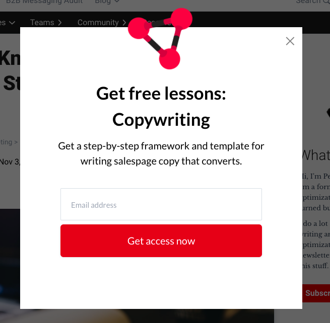
Here is an example from CXL blog offering a free copywriting lesson when you subscribe to be part of their email list:
2. Use descriptive CTA
Instead of having a CTA that just says 'sign up' & create a CTA copy that is attached to the action that will happen when someone signs up for your newsletter.
Few options are:
- Send me the e-book
- Become a copywriter
- Get 10% discount
- Try for free
This will be based on the end goal of your website or blog. If you want people to enroll in free trial, 'Try for free' works, if you want to create a list of people who are starting in their email marketing journey, 'Get the basics of email marketing' would work and if you want a freebie to someone in return for signing up, then 'Send me a freebie' would work better.
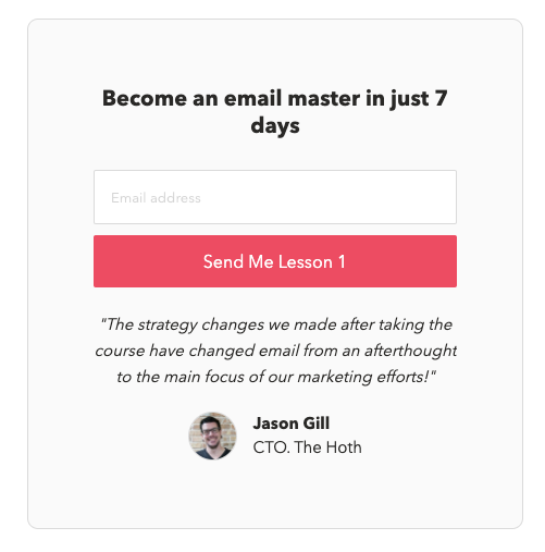
Here is an example of signup form with actionable CTA from Email Mastery:
3. Include social proof
Social proof is one of the principles of persuasion. It is a psychological phenomenon where people will follow the actions of others. It can ease the minds of worried customers. People trust a brand or company more when they see others have subscribed to them as well.
You can do this by:
- Showing the hundreds or thousands of subscribers you have
- Showing a quote from a credible industry person.
4. Tell subscribers what they will receive
People generally don't give their email address so easily because spamming is a common problem these days. You sign up on a website but end up receiving random emails.
To clear any objections in people's minds, tell them exactly what they will receive & when they will receive it.
5. Keep minimal number of fields
Nobody wants to do hard work, so if in the signup form you ask people to enter a lot of details, they will not complete it. Hence, they will not sign up.
So keep a minimum number of fields. Mostly, name & email address works the best.
If you have a business case where you need a zip code, for example, in the case of eCommerce, you can ask that. Or if you are a B2B company, it might make sense to ask for the company URL.
But if possible, just stick to asking for an email address.
These were just the best practices we have seen working with numerous email newsletters. But let's do a mini-teardown of some real-world, high converting email newsletter sign up forms. We will see what's great about each one & how you can use SendX to create these for your own website.
8 Examples of Highly Optimized & High Converting Signup Forms
1. Google
You probably didn't know this but Google has a blog called The Keyword and if you visit that, you get this popup signup form to get the latest news from Google in your inbox.
It is called a popup or modal sign up form.
What makes this signup form effective?
- Clear Value prop to get the latest news
- Brand-aligned design. The colors and clean look match with Google's brand image.
- The text before the CTA eases the mind of the subscriber by saying that they can opt out anytime.
2. Marketing Examples
Marketing Examples website also uses a popup/modal signup form.
What makes this signup form effective?
- Frequency: By saying every couple of weeks, it shows that it's not going to bother you every day.
- Social Proof: This signup form is heavy on social proof. It uses the number '49K marketers' & good words said by some marketers below the CTA to show that their work is credible and valuable.
- Form field: There is only 1 form field, email address which makes it super quick to sign up
- Human touch: By starting the copy with 'Hey, I am Harry', it adds a human touch and we know that people want to connect with other people and not some faceless company.
How can you create such email sign up forms?
SendX provides the perfect template to create these in different sizes. You can customise the text, color and background of these templates.
Here are some examples from our actual form library. You will get access to all of these forms when you sign up for SendX's 14-day free trial.
3. Optimize My Airbnb
This is a company that helps Airbnb homeowners optimize their listing. They use a bar for signup form. This bar stays on the website at all times, even when you scroll up & down. It's called a hello bar & can be placed either at the top or bottom of the website.
What makes this signup form effective?
- Unobtrusive: This kind of signup form doesn't distract from reading anything on the website while staying sticky on the website.
- Single field: It only asks for an email address and takes a few seconds to fill in.
- Simple brand design: The colors are inviting and not too contrasting or dull.
How can you create this for your website?
SendX provides various kinds of hello bars that you can customize to suit the look and feel you want.
4. Morning Brew
Morning brew uses a full page signup form. They have only one job: to deliver news to your inbox every day and that's what highlights as the value prop on this page.
What makes this signup form effective?
- Preview: It shows a preview of the newsletter in a mobile mock up. This helps people visualize that it's going to quick and easy to read it, even on the go.
- CTA: Try It is more conversational than Sign up or Subscribe. It also reduces the pressure to commit to something , thus easing their subscription.
- Copy: The copy here follows headline & sub-headline structure. The headline hooks people with a catchy copy and then subheading explains it further.
How can you create this for your website?
You can use the Page Takeover Right Template to execute this for your website.
The image here is customizable and if you have run out of ideas, SendX has a free stock image library of half a million photos!
5. 1 chic retreat
1 chic retreat is a blog that talks about how to get the maximum value out of your rental property.
The home page offers a free guide to short-term rental essentials. When you click on the button - 'Subscribe' to get that, a popup opens up where you enter your name & email address.
What makes this signup form effective?
- Value: By offering a free guide on 31 vacation rental essentials, this signup form promises something valuable to the subscriber. You can tailor make something like this for your industry.
- Visual: It is using the left space for image very effectively by having not just an image, but a bold headline on top of that.
- Clarity: There is no confusion on what you will get when you sign up. This makes it easy for someone to make a decision whether they want to sign up or not.
How can you create this for your website?
You can use the Page Takeover Left Template to execute this for your website.
The image here is customizable and if you have run out of ideas, SendX has a free stock image library of half a million photos!
6. Sleeknotes
This email signup form on Sleeknotes blog is called a 'slide-in' form because it slides in from the bottom right corner of the page. It's not as distracting as a popup and it's not as subtle as a hello bar that it gets missed.
What makes this signup form effective?
- Headline: It tells the frequency of the newsletter, that is weekly. It also tells that you will get marketing related stuff.
- Social proof: It tells the number of marketers who & also have one line quotes as social proof.
- CTA: It is exciting and shows you that you get access to everything once you sign up.
7. Froknowsphoto
Froknowsphoto is a photography related website where you can get the latest tips, gadgets information and guides on photography. It also has a slide-in email signup form.
But rather than being horizontal, it is vertical. This would help make it mobile optimized.
What makes this signup form effective?
- Value proposition: It says that you will be taking better photos by the end of the week. This is a compelling value proposition and will get higher signups.
- Brand aligned: The color of the icons, main heading and button align with the brand thus not creating a distracting feeling.
8. Headspace
Headspace is an online company that provides meditation through its app.
When you visit their blog, you get a slide-in email signup form that offers a chance to get their newsletter in your inbox.
What makes this signup form effective?
- One field: Unlike the previous example that we saw, this form asks you to fill up only one field. That makes it easy and quick to sign up.
- Short copy: It has a short, punchy copy and thus it occupies very less space. This makes it very less distracting.
How can you create these in SendX?
To create slide-in email sign up forms like Sleeknotes, Froknowsphoto or Headspace, you can use these two templates that SendX has:
- Slider Template
- Slider Modern Template
The content and color of the slider are customizable. You can change everything from text, headline, form fields text, background color etc.
Conclusion
Now that you know the top tips & breakdown of some of the best email signup forms, it's time to create your own. All you need to figure out is what's going to be your pitch on the form & what kind of design you want. For the pitch, you will have to work around your business goals, resources available etc.
But for the design part, don't worry and checkout SendX. SendX has all kinds of email signup forms - popups, embedded, full page etc. Signup process is as easy as signing up for a newsletter. You don't even need a credit card. Signing up today will give you 14 days of free trial.