
You, as a savvy marketer, understand that design is not merely a decorative add-on, it is the key to unlocking the full potential of your message. It is the visual language that entices, engages, and compels your audience to take action.
Yet, the impact of design on deliverability is often overlooked, overshadowed by other elements of an email marketing strategy.
Design is as important as text and technical aspects in email marketing. A cluttered email with too many images or one that lacks responsive design is bound to end up in the spam folder.
In this article, we will uncover the secrets behind optimizing your email design for maximum deliverability, highlighting the factors that determine whether your emails reach the primary inbox or get lost in the promotions tab.
What is Email Design?
Email design refers to the visual and aesthetic aspects of an email message, including layout, formatting, colors, typography, images, and overall visual appeal. It encompasses the creative elements that contribute to how an email looks and feels, making it engaging and effective in conveying the intended message.
Good email design goes beyond visual appeal; it helps improve deliverability and enhances user experience. Well-designed emails catch attention, maintain readability, and are accessible across devices and email clients.
Effective email design considers branding consistency, responsive layouts, concise copy, strategic image placement, and quick loading times. Its goal is to create a cohesive and impactful experience that resonates with the audience, encourages engagement, and drives actions such as clicks or purchases.
TL;DR for the Busy Email Marketer
A quick overview of tips to create email designs that improve deliverability:
Mobile-first design: Ensure responsiveness across devices, especially mobile.
Clean layout: Keep it simple and easy to navigate with key details visible.
Balance between text and images: Avoid relying solely on visuals.
Optimize images: Compress for faster load times.
Use ALT tags: Add descriptive text for images when disabled.
Readable font sizes: Use 14–16px for body text.
Standard fonts: Stick to web-safe fonts like Arial or Verdana.
Clear CTA: Use noticeable buttons near the top.
Test across platforms: Check rendering across email clients.
Limited CSS: Keep CSS inline and minimal for compatibility.
But it's best to explore each tip in detail. Let's dive into that.
Creating a Design that Passes the Deliverability Test
Mobile-First Design:
In a mobile-first world, responsive design is essential. Choose templates that adjust automatically across devices. Ensure buttons and links are large enough for tapping without misclicks. Simplify layouts with single columns for smaller screens and leave ample white space between clickable elements.
Consider the following tips:
Use a responsive email template: Choose or create an email template that automatically adjusts its layout and elements based on the screen size. This ensures a seamless user experience regardless of the device used to view the email.
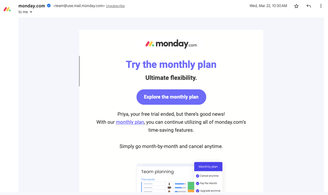
Email on desktop
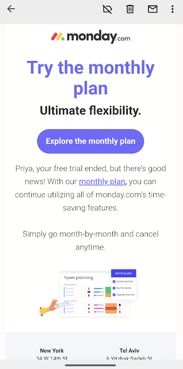
The same email viewed on mobile…
Optimize for touch: Since mobile users interact with emails using their fingers, make sure your buttons and links are large enough to be easily tapped without accidentally triggering other elements. Leave enough space between clickable elements to prevent mis clicks.
Example of mobile-first design with big CTA, and ample space around it

Simplify the design: On smaller screens, complex layouts can become cluttered and difficult to navigate. Keep your design clean and straightforward, with a single-column layout that guides the reader's attention smoothly.
Here's an example…
Clean layout
A clean layout improves readability and engagement. Use white space to separate content and avoid overcrowding.
Prioritize critical information, such as CTAs, near the top. Maintain consistent colors, fonts, and formatting to reinforce brand identity.
Use ample white space: White space (or negative space) helps separate elements, making the email visually appealing and easier to scan. Avoid overcrowding your email with too many images or text.
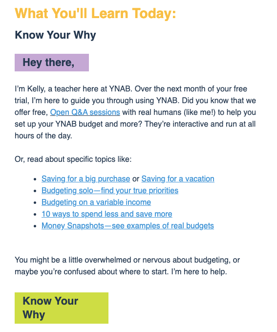
Prioritize important information: Place crucial information, such as the main message or call-to-action (CTA), in prominent positions, preferably near the top of the email. Use headings, subheadings, and bullet points to break up the text and make it more digestible.
Here's an example…
Maintain visual consistency: Stick to a consistent color scheme, font style, and formatting throughout the email. This reinforces your brand identity and makes the email more visually appealing.
Balance between text and images
Use HTML text rather than embedding text in images for accessibility. Include descriptive ALT tags for all visuals. Support every image with accompanying text so the message remains clear, even if images fail to load.
Consider the following suggestions:
Use HTML text: Instead of embedding text within images, use HTML text whenever possible. Text within images cannot be read by screen readers or searched by email clients, potentially resulting in poor accessibility and lower deliverability.
Provide alt tags for images: ALT tags serve as alternative text descriptions for images. When images are disabled or not loaded by the email client, ALT tags help convey the intended message. Ensure your ALT tags are descriptive and provide value even without the visual context.
Complement images with text: Use text to reinforce the message conveyed by images. For example, if you're showcasing a product, include a brief description or key features in the text to ensure recipients understand the content, even if the images are not displayed.
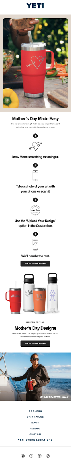
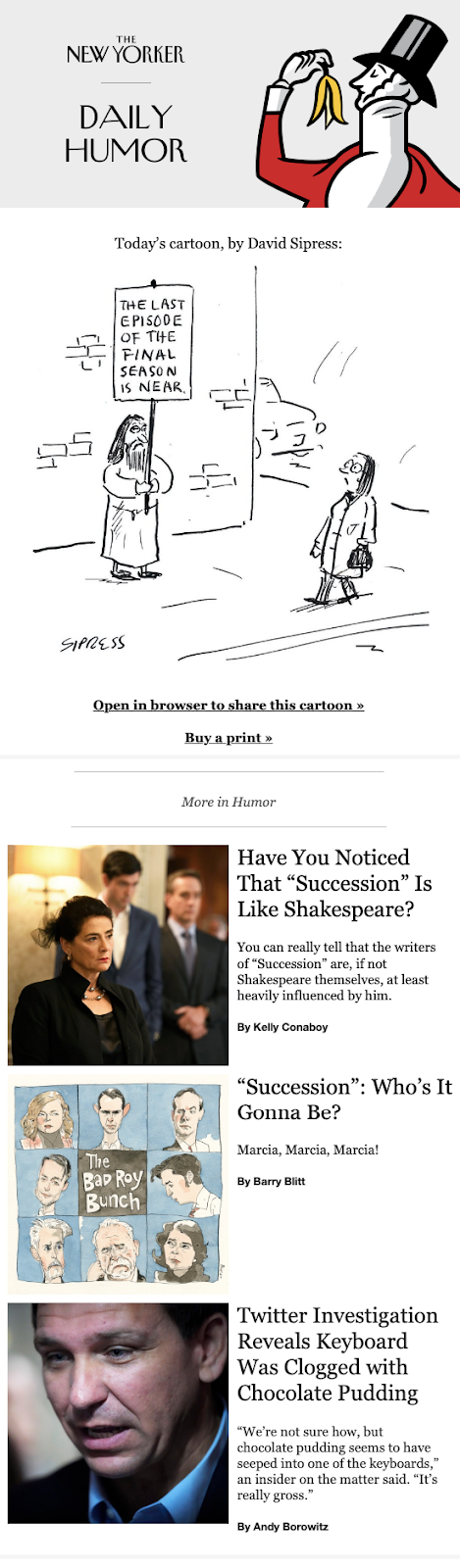
New York Humor emails keep a healthy balance between text and images.
Optimize images
Compress image files to speed up loading and reduce bounce rates. Choose the right format—JPEG for photos, PNG for graphics, and GIF for simple animations. Use appropriately sized images to prevent distortion or lag.
Here are some tips to optimize your images:
Compress your images: Large image file sizes can slow down email loading times, leading to higher bounce rates. Use an online image compressor tool or software to reduce the file size without compromising image quality. Aim for a balance between file size and visual clarity.
Choose the right file format: Selecting the appropriate file format can significantly impact image quality and loading speed. JPEG is best suited for photographs, while PNG is ideal for graphics and images with transparency. GIFs can be used for simple animations.
Size your images correctly: Ensure your images are sized appropriately for the email layout. Avoid using oversized images that may require resizing within the email client, as this can distort the image or cause it to load slowly.
Use ALT tags
Always include concise, descriptive ALT text that conveys the purpose of each image. ALT tags aid accessibility for visually impaired users and ensure your message is understood even if images are blocked.
Consider the following when using ALT tags:
Be descriptive: Write ALT tags that accurately describe the content or purpose of the image. This helps visually impaired users understand the image and provides context for search engines.
Keep it concise: ALT tags should be concise but informative. Avoid lengthy descriptions that may overwhelm readers using screen readers.
Don't use ALT tags as a substitute for text: While ALT tags are useful, they should not replace essential text within your email. Use ALT tags to supplement the information rather than relying solely on them to convey your message.
Readable font sizes
Use 14–16px for body text and larger sizes (around 22px) for headings. Test across devices to ensure readability without zooming.
Follow these tips for setting font sizes:
Body text: Use a font size between 14px and 16px for the body text. This ensures readability on both desktop and mobile devices. Avoid using smaller font sizes, as they may strain the reader's eyes.
Here's an example of an email with readable font size for all text.

Headings and subheadings: Use larger font sizes for headings and subheadings to create visual hierarchy and guide readers through your email. A font size of 22px or larger for headings is generally recommended.
Consider the device: Remember that mobile devices have smaller screens, so ensure your font sizes are adjusted accordingly. Test your email on different devices to ensure the text is legible without zooming in.
Standard fonts
Stick to web-safe fonts like Arial, Helvetica, Verdana, or Times New Roman for consistency. Always specify fallback fonts in your CSS for unsupported cases.
Here are some practical tips to keep in mind:
Stick to web-safe fonts: Web-safe fonts are fonts that are widely available across different operating systems and email clients. Examples of web-safe fonts include Arial, Helvetica, Times New Roman, and Verdana. By using these fonts, you minimize the risk of your email appearing differently or displaying fallback fonts on various platforms.
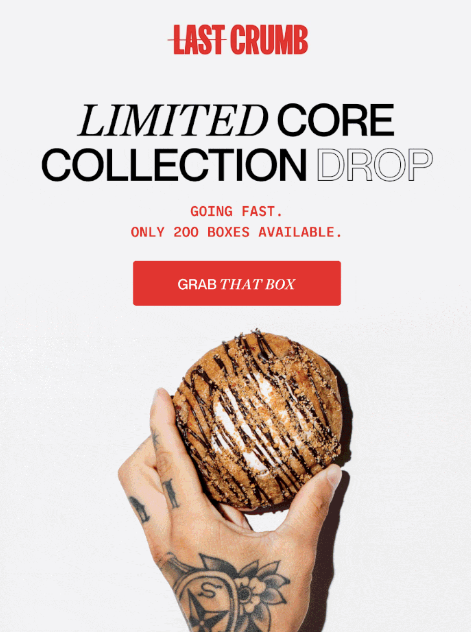
Example of email using standard fonts but doesn't seem boring as they balance it with colors…

Consider font compatibility: While web-safe fonts are generally a safe choice, it's still important to consider font compatibility across different devices and email clients. Some fonts may render differently or not be supported on certain platforms. To ensure consistency, test your email design on popular email clients and devices to verify how the fonts appear.
Use fallback fonts: In case a recipient's email client doesn't support your chosen font, it's essential to specify fallback fonts in your CSS. This allows the email client to display an alternative font that closely matches your original choice, maintaining consistency and legibility.
Clear CTA
Design CTAs to stand out using contrast and action-driven language. Place them near the top for maximum visibility and engagement. Examples: “Get Started,” “Shop Now,” or “Claim Offer.”
Consider the following practical tips to optimize your CTA:
Make it visually distinct: Ensure that your CTA stands out visually by using contrasting colors, larger font sizes, or even buttons. The CTA should immediately catch the recipient's attention and be easy to locate within the email.
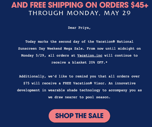
Example of Stand-out CTA with contrasting colors, capitalized font.
Place the CTA strategically: Position your CTA in a prominent location within the email, ideally towards the top where it is immediately visible without scrolling. Placing it at the end of the email may result in lower click-through rates, as some recipients may not read the entire email.
Use action-oriented language: Craft your CTA text using action verbs that prompt recipients to take action. For example, instead of a generic "Click here," use a more specific and compelling CTA like "Shop Now," "Get Started," or "Claim Your Discount."
Test across platforms
Use tools like SendX or SendPost to preview your email design across clients such as Gmail, Outlook, Apple Mail, and Yahoo Mail. Test across mobile, tablet, and desktop devices to confirm layout stability and rendering accuracy.
Consider these practical testing tips:
Use testing tools: Utilize email testing tools that simulate various email clients and devices. These tools provide insights into how your email renders and functions across different platforms, allowing you to identify any issues or inconsistencies.
If you use tools like SendX or Sendpost, the preview tool is in-built. You won't have to use any other tool.
Test on popular email clients: Prioritize testing on popular email clients such as Gmail, Outlook, Apple Mail, and Yahoo Mail. These clients cover a significant portion of the email user base and may have unique rendering behaviors or limitations.
Test on different devices: Ensure that your email looks good and functions properly on both desktop and mobile devices. Test on smartphones, tablets, and different screen sizes to verify responsiveness and usability.
Limited use of CSS
Because many email clients don’t fully support CSS, use it sparingly and inline. Avoid complex animations or advanced positioning, and test thoroughly to ensure your design appears consistently across devices.
Consider these practical tips for CSS usage:
Inline CSS: To maximize compatibility, inline your CSS styles directly within HTML tags. This ensures that the styles are applied consistently across email clients.
Avoid complex CSS features: Some CSS properties or techniques, such as CSS animations or advanced positioning, may not be fully supported by all email clients. Stick to simpler CSS styles like font colors, backgrounds, padding, and borders to ensure consistent rendering.
Test extensively: Test your email design across multiple email clients, devices, and platforms to identify any CSS-related issues. Pay attention to how the CSS styles are rendered and whether they are consistent with your intended design.
Conclusion
Creating an effective email design for deliverability requires optimizing images, using descriptive ALT tags, choosing readable fonts, adding clear CTAs, testing across clients, and keeping CSS minimal.
Keep your designs creative but simple. Experiment with different layouts and colors to see what drives engagement. Use performance data to refine your approach.
When it comes to reliable email delivery, SendPost is here to help. SendPost provides an Email API and SMTP relay for developers, software businesses, and ESPs. With our tools, expertise, and support, you can ensure that your emails are delivered consistently and effectively. Don't let your email campaigns fall short—partner with SendPost for reliable email delivery solutions.