

Before we start, I want to clarify that I know the right name is typeface and that font refers to the specific characteristics of a typeface, such as size, weight, and kerning.
However, this is not a graphic design article, so I will use the term font, as most people do. When I talk about selecting the best font for email marketing, I am referring to the typeface. With that out of the way, let's get started. What is the right font for your email marketing campaigns?saI don't have the perfect answer to that question, but I sure as hell can show you some topics that you should have in consideration while choosing your font.
And after that, you can make that decision by yourself.We will analyze factors such as readability, communication goals, and brand alignment. Once you understand these elements, you will be able to choose the best font for your emails.
Table of Contents
Choosing the Best Font for Your Email: Readability
There’s no way around this. If you took the time to write an email, it’s because you want people to read it. Whether your goal is to inspire action or simply ensure understanding, you must use an email-friendly font that enhances readability.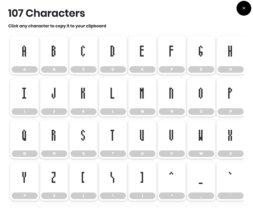 Source: font space
Besides choosing a readable font, contrast also plays an important role.
Many of us, myself included, have chased trendy designs for the sake of style. However, some of these designs use grey text or low-contrast backgrounds, which can make reading difficult for users who genuinely want to consume your content rather than admire the layout.
Interestingly, Daniel Kahneman, in Thinking, Fast and Slow, notes that when people struggle to read text due to low contrast or poor font choice, they may remember the message better. Is that worth testing? Perhaps. The choice is yours.
What Do You Want to Communicate?
This is an important question because your answer will guide you toward the right font for your email marketing campaign.
Do you represent a classic or family-owned business that emphasizes tradition and trust? Then a serif font might be your best choice. If your brand seeks to appear modern and innovative, a sans-serif font would be ideal. People tend to associate sans-serif fonts with technology, websites, and apps.
You should also consider the length of your emails.
If your emails are short or arranged in small content blocks, sans-serif fonts are typically easier to read. But if your emails are long, similar to articles or newsletters, serif fonts improve readability in dense text.
Where to Find Free Fonts for Your Email Marketing
When choosing a font, keep in mind three things: readability, brand image (classic vs. innovative), and your writing style (short vs. long form).
Another key factor is where you get your fonts.
You could purchase a custom font or use one from your brand kit, but that may not be compatible with all email clients. Some devices or platforms may fail to render it correctly.
A safer and free alternative is Google Fonts, which offers a wide variety of options that are supported across most platforms.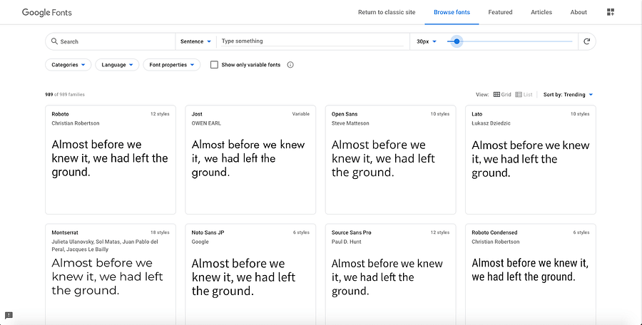 To use them, simply insert the link to the font in your HTML tag. This allows the reader’s email client to fetch the font directly from Google’s servers, ensuring your email looks the same everywhere.
Our Top 4 Picks for The Best Font for Emails
Using web-safe fonts ensures better compatibility across devices. The following fonts are highly readable and widely supported.
Helvetica
A favorite among designers, Helvetica is a classic sans-serif font used by brands like BMW. It’s preinstalled on macOS but must be downloaded separately for Windows users.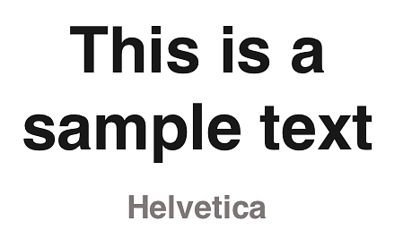
Georgia
Designed for Microsoft in the 1990s, Georgia remains one of the most popular fonts for emails. It’s used by Twitter, Amazon, and Yahoo. It may not be flashy, but it’s reliable and universally supported
It might not be the most creative font to use, but it's the safest choice since it is available in documents, email clients and writing tools.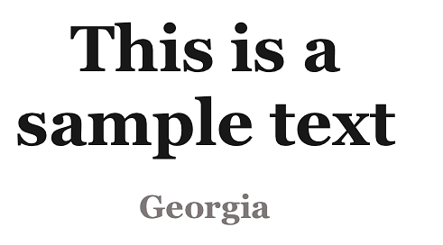 Calibri
Created by Microsoft as a sans-serif alternative to Times New Roman, Calibri is clear, readable, and works across all devices and email clients. It’s an excellent default choice if you’re unsure which font to use. Arial
Arial
Arial is one of the most widely used fonts and the default for Google Docs. It gives a personal, human touch to your messages, making them appear straightforward and approachable. Still Not Sure What Would Be the Best Font for Your Email?
Selecting the right font for your emails—or any business communication—is not always easy.
If I told you there’s a font scientifically proven to improve reading speed and comprehension, would you try it?
The font is Lexend, developed by Bonnie Shaver-Troup and Thomas Jockin. Supported by Google, Lexend was designed from the ground up for maximum readability. You can find it for free on Google Fonts.
If you’re still undecided, start with Lexend. If it doesn’t fit your brand, refer back to the earlier sections and choose a different one based on your communication goals.
The only wrong choice is selecting a font that makes your email hard to read. Everything else is fair game.
FAQs
1) What are the most suitable fonts for my email?
There’s no universal choice, but some web-safe options include Arial, Helvetica, Verdana, Comic Sans (for animated emails), Times New Roman, Courier, Tahoma, and Georgia.
2) What should I consider before choosing a font for my email?
Your font should be readable, align with your brand identity, and match the tone of your email.
3) What is a good font for a classic or traditional business?
A serif font is ideal for traditional or family-run businesses that want to emphasize trust and longevity.
4) What is a good font for a modern and innovative business?
Sans-serif fonts are best for contemporary, forward-thinking brands. Examples include Arial, Helvetica, and Open Sans.
5) Where can I find free fonts suitable for email marketing?
Google Fonts is a reliable source for free, web-safe fonts that display correctly across most email clients.