

You’ve probably already read this before: for every one dollar that you spend on email marketing, you get a return of $42. As a marketer, you’d also be already knowing that 73% of marketers describe email marketing ROI as “good” and “excellent.”
But here’s the thing: to get such a return on investment (ROI) for yourself, you need to invest in all aspects of email marketing to make your newsletter a success including paying attention to small details like the email header design.
An effective email header hooks your audience and encourages them to read your message. It also reveals the purpose of your email plus familiarizes your readers with your brand. Wondering how you can achieve this and more with email header design?
Let’s walk you through the basics of email header design and hand over nine tried and true tips to design your header along with examples.
Table of Contents
- What’s an Email Header?
- Email Header Design Tips: 9 Tips to Live By
- 1. Be consistent with your header image
- 2. Use your logo in your header space
- 3. Put your brand mascot to work in the header section
- 4. Use an image for your email header design
- 5. Share valuable information in the header area
- 6. Use the email header design to personalize
- 7. Compliment the reader in the header
- 8. Use a headline to encourage readers to read your email
- 9. Animate your email header
- Email Header Design: Best Practices
- Wrap Up Thoughts
- FAQs
What’s an Email Header?
First, before we dive into our essential header design tips, it’s important to cover the basics – what is an email header, and where will you use one?
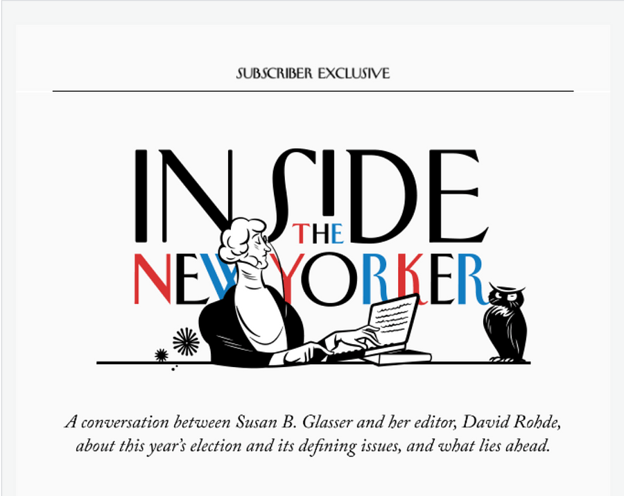
Essentially, the email header is an HTML code that shares details such as your authentication signature. This bit is, however, not visible to your readers. Hence, in the context of marketing, an email header is simply the upper section of your email that looks like this:
For a deeper context, know that your email is divided into three sections:
- Header
- Body
- Footer
The body is where the meat of the matter is — the content and the rest of the shebang. The footer, on the other hand, packs details like your company address. This leaves you with the header: the introductory part of your email that sets the tone of the entire message.
Email Header Design Tips: 9 Tips to Live By
Now that you know what an email header is and how important it’s role is in introducing your brand and message, let’s cut to the chase:
1. Be consistent with your header image
This doesn’t mean you’ve to be boring. It only means that while designing an email header template, you’ve to stick with your brand colors and fonts pre decided in your visual brand style guide.
Such consistency in your visual brand helps you leave a memorable impression on your audience. How? Let’s give you an example: a reader visits your content writing site, for example, and subscribes to your emails. They note that you’ve a black and white theme on your site including in your blog graphics and messenger live chat bot.
As a result, the reader subconsciously expects to see the same in your emails. But when your email pops up, they see a pink and purple-themed letter.
Know what happens in that case? The reader gets confused, asking themselves ‘is this a content marketing newsletter or a style magazine email? Did I subscribe to the right email newsletter?’
However, if you send out the same black and white-themed newsletter, they can instantly recall your site and tell that the newsletter is from you. This assists in making a memorable impression on your target audience.
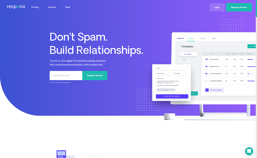
Here’s a real-life example: I hopped on to Respona’s site and saw they’ve a purple with green color scheme:
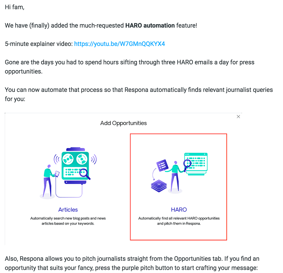
Next, I look at their newsletter and can instantly tell it’s from the link building software:
That said, remember to be consistent with your brand personality as well. If your live streaming platform, for example, has a bold personality, reflect that in your header design.
2. Use your logo in your header space
This is an excellent email way to be consistent with your brand identity. Readers can instantly become familiar with your logo and recognize you outside the email space too.
Look at these Spotify emails:
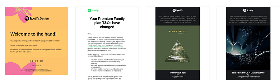
The striking email header design here uses the logo. But the brand has added a unique touch by changing the logo’s color in some emails. If you’ve a prominent brand with a well-known logo, this is something you can consider doing.
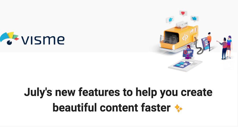
Alternatively, take a creative approach by sharing your logo with an image or graphic that showcases what you do. This one’s a hat tip to Visme, an infographic maker that has a email header with their logo and an explanatory graphic:
3. Put your brand mascot to work in the header section
If you have a brand mascot, you can absolutely make the most of it in your email header image. Brand mascots have a high familiarity rate. For instance, Disney’s Mickey Mouse has a 98% recognition rate among children between the age bracket of 3-11.
Adding your brand mascot to your email header, therefore, helps boost recognizability. On top of that, they make your business personable — giving it a human touch. Not to forget, you can add a touch of storytelling by putting your brand mascot into action.
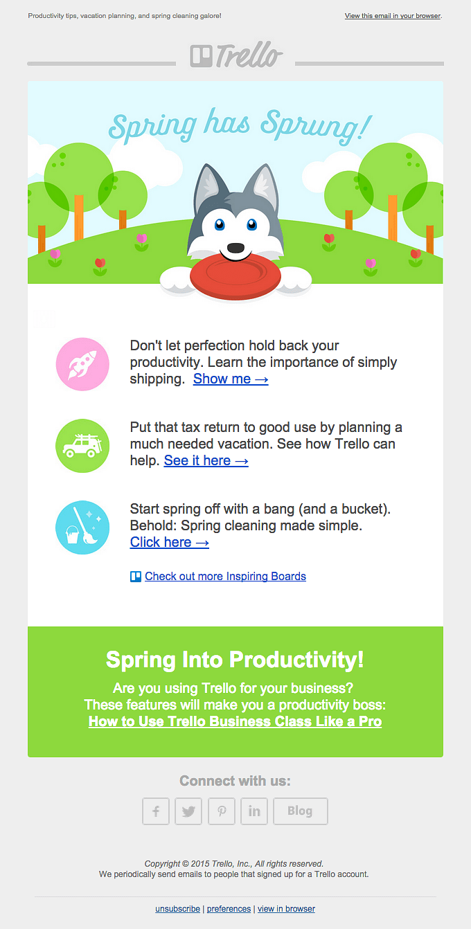
See how Trello explains what their email is talking about using their brand mascot, Taco. In this first example, you can instantly see Taco’s background depicts spring’s arrival:
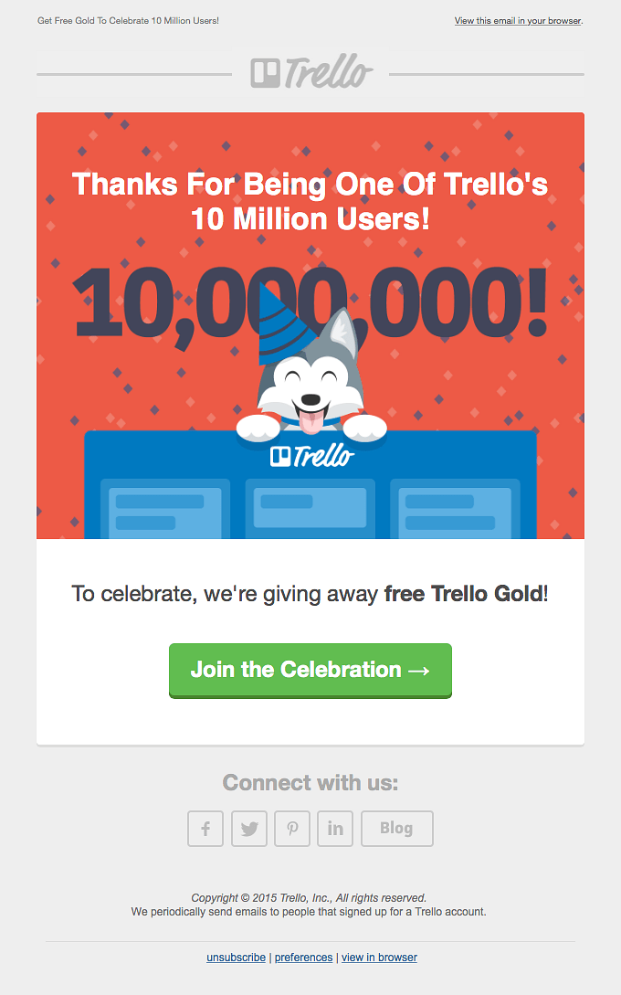
And, in this second example, you can instantly tell Taco is celebrating a milestone:
4. Use an image for your email header design
High-quality images can effectively deliver your email’s theme. But you have to keep this in mind: steer clear from using stock photography.
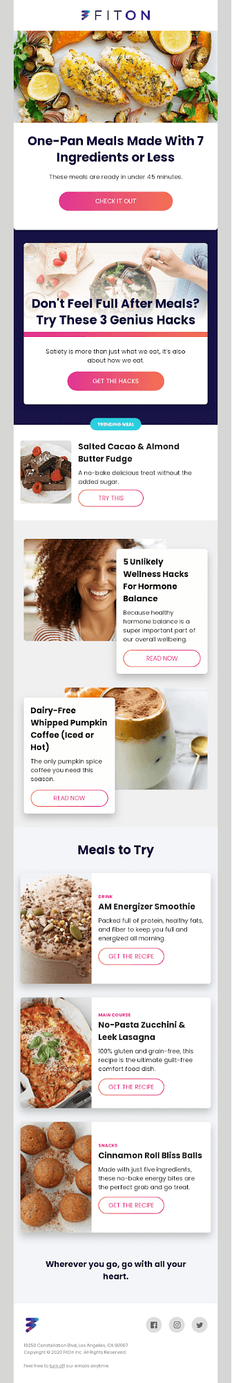
It’s best to get a professional to take high-quality, crisp pictures of your product in action. This is, particularly, effective if you’re a food brand because photographs showing appetizing images can catch your audience’s attention in a heartbeat.
Here’s a mouthwatering example:
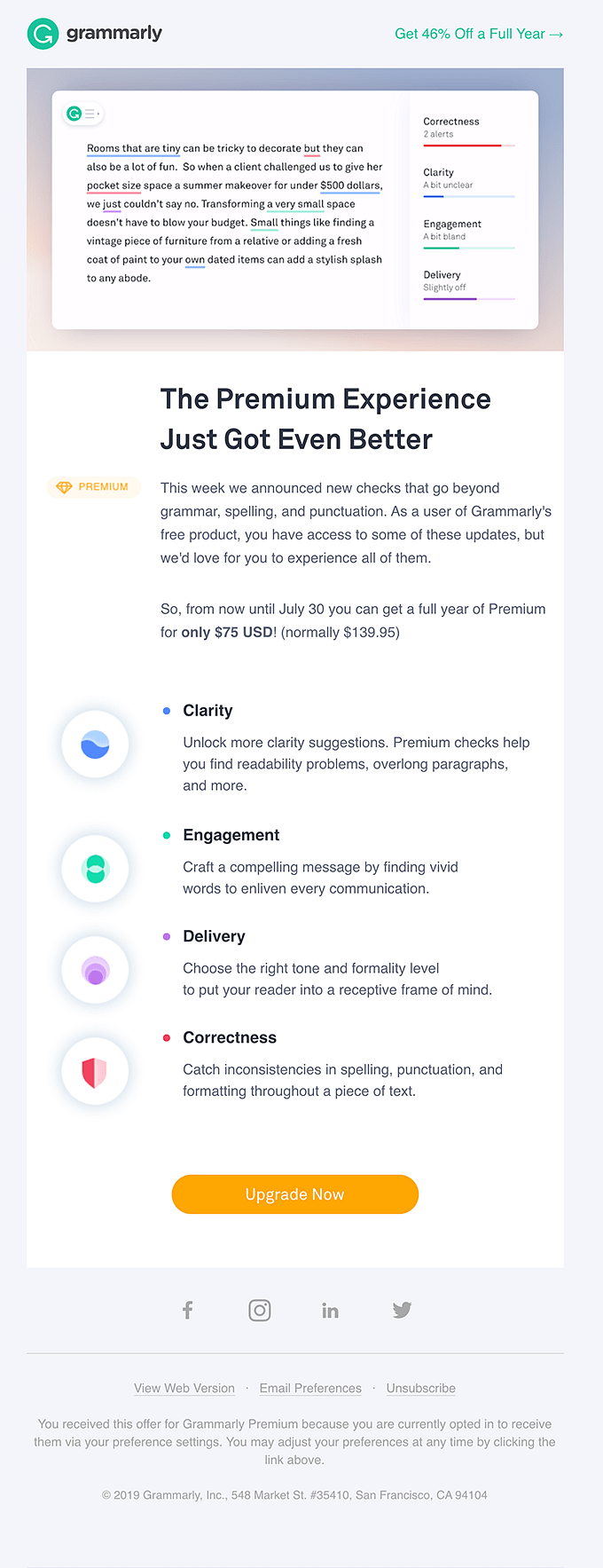
Alternatively, use screenshots like Grammarly did in this email:
5. Share valuable information in the header area
There’s plenty of information you can share here. For instance, consider moving the ‘update your preferences’ or ‘unsubscribe’ options to the header. Doing so shows your readers you care about their preferences, therefore, you’re making an effort to make this update option accessible for them.
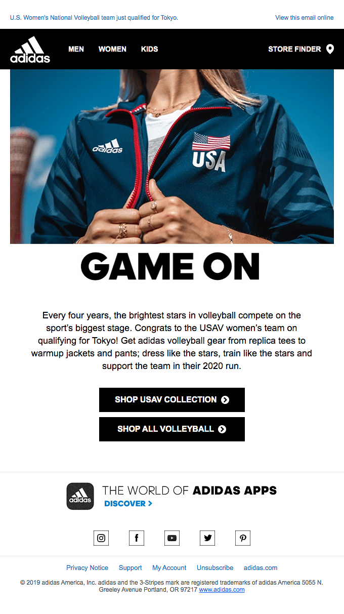
If you’ve multiple store locations, you can also move your store finder in the email header design as Adidas does:
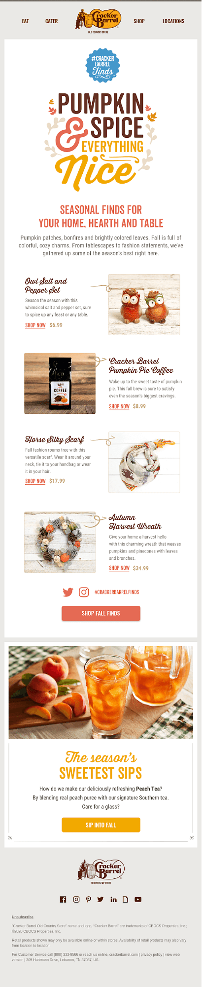
Cracker Barrel, on the other hand, shows the following useful categories in their email header:
6. Use the email header design to personalize
Personalization can up your email marketing game in a jiffy. No wonder, 74% of marketers applaud targeted personalization for increasing customer engagement.
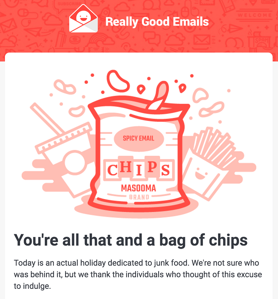
But there’s more to personalization than starting your emails with your reader’s name and segmenting your list. This email from Really Good Emails is the perfect example of an email header design that takes personalization into account:
Such personalization is quick to win hearts and build strong relationships with your email list as part of your customer loyalty program.
7. Compliment the reader in the header
A compliment in the email header can make your reader feel special, therefore, connected to you. Isn’t such a reader going to scroll down? You bet, they will!
In fact, a positive remark can inspire readers to take action. This is something that Sephora has done in this email:
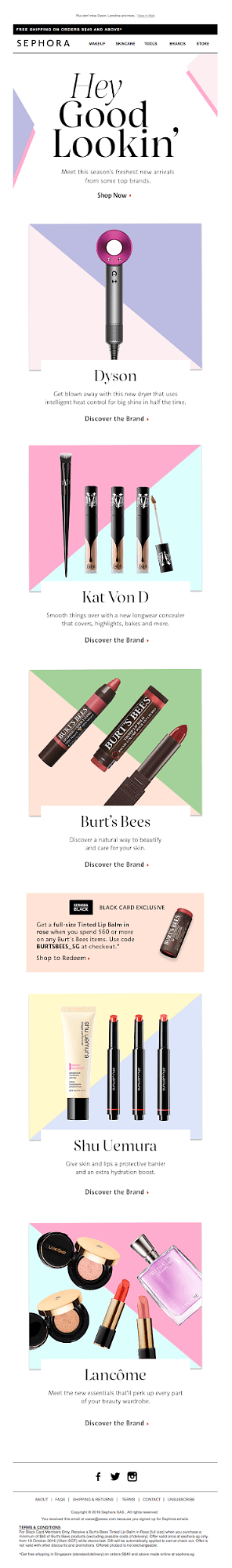
They’ve a section with important information that we discussed above, followed by a compliment that’s paired with a call to action (CTA) to encourage readers to take action.
8. Use a headline to encourage readers to read your email
Strong copywriting can help you take your reader from the start of the newsletter to the end. Wondering what works best in the email header? A short, convincing headline.
Look at this email header using a headline following by a brief explanation of what’s offered and a CTA that pushes people to take action:
9. Animate your email header
Another creative approach to designing your email header involves animating the design. Animation succeeds at not only getting your audience’s attention, but holding it as in this email:
You can put your product in action as well with a GIF:
Just one thing to remember: don’t over-animate. Only animate a part of the header, so your design doesn’t confuse readers.
Email Header Design: Best Practices
Before we wrap this post, it’s best to share some best practices that you need to keep in mind for each of the tips you read today.
Here you go:
- Use sufficient whitespace to give your email header design breathing space. This also keeps the section clear and clutter-free.
- Make sure the design is easy to read, accessible, and user-friendly. In other words, your logo, font size, and other additional information have to be easy to read.
- Keep the email width to around 600 pixels. Readers view your emails on different devices such as smartphones, desktops, and tablets. They also read your emails under different circumstances like in a browser inbox. This sets the need for sticking with the universal size for the email header width.
- You need to use email safe fonts as well. These are fonts like Georgia, Times, Times New Roman, Verdana, Arial, Helvetica, Impact, and more that are supported by all email clients.
And here are some factors to keep in mind when it comes to designing an email header:
- Clear Branding: Incorporate your logo and brand colors prominently for instant recognition.
- Compelling Imagery: Use high-quality visuals that resonate with your audience and reinforce your message.
- Attention-Grabbing Subject Line: Craft a concise, enticing subject line that compels recipients to open the email.
- Personalization: Include the recipient's name or other personalized elements for a tailored experience.
- Mobile Optimization: Ensure the design is mobile-responsive for seamless viewing across devices.
Wrap Up Thoughts
From animating your header design to using your logo or image in the header section, you now know that you can take a ton of creative approaches to your email header design. No matter what you do though, the idea is simple: get your reader’s attention and get them to scroll down and read your message. And to implement a great email header design in your emails, you will need an email marketing software like SendX which comes with a 14-day free trial (no credit card required). So are you ready to put your design chops to work?
FAQs
1) What sections is an email divided into?
The email is divided into three sections: header, body, and footer. The body is where the main content is. The footer consists of details like your company address. The header is the introductory part of your email that sets the tone of the entire message.
2) What is the purpose of an email header?
An effective email header hooks your audience and encourages them to read your message. It also reveals the purpose of your email, plus familiarizes your readers with your brand.
3) Can you offer some tips to design great email headers?
Some tips to design great email headers are:
- Be consistent with your header image
- Use your logo in your header space
- Put your brand mascot to work in the header section
- Use an image for your email header design
- Share valuable information in the header area.
4) Can you share some email header design best practices?
Here are some email header design best practices to keep in mind:
- Give your email header design breathing space by using enough whitespace
- Make sure that your logo, font size, and other additional information are easy to read
- Keep the email width to around 600 pixels
- Use email safe fonts like Georgia, Times, Times New Roman, Verdana, Arial, Helvetica, and Impact.
